Font
When we do our design for the title sequence we need to think very carefully about that type of fonts we want to use.
There are two types of fonts
Serif fronts- such as Times and Courier:Serif fonts are generally more traditional and often more formal than sans serif fonts. (A serif is the extra little detail at the end of each stroke of every letter.)
Sans Serif Fonts- such as Ariel and Comic Sans: Sans serif fonts are generally more informal, more modern and more 'friendly'.
Font Analysis

The font that is used on this pearl harbour poster is
PALATINO. This font suggests that it has been done by a type writer and this is what they used in those times. Also its formal so maybe it is suggesting this film is showing the professionalism of what the people of these time were like.
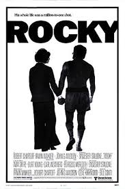
This is a poster of the film Rocky, the font that's being used is
Franklin Gothic Heavy. Analysing the font, it is bold, big, strong and heavy. This can represent that rocky is big and strong and powerful just from the front.
No comments:
Post a Comment